Tesla Plans Android Foldable App Fix as Screen Breakpoints Get Refined
Tesla says it will tune the app’s screen size breakpoints after some foldables stretch the phone layout until users rotate to landscape.
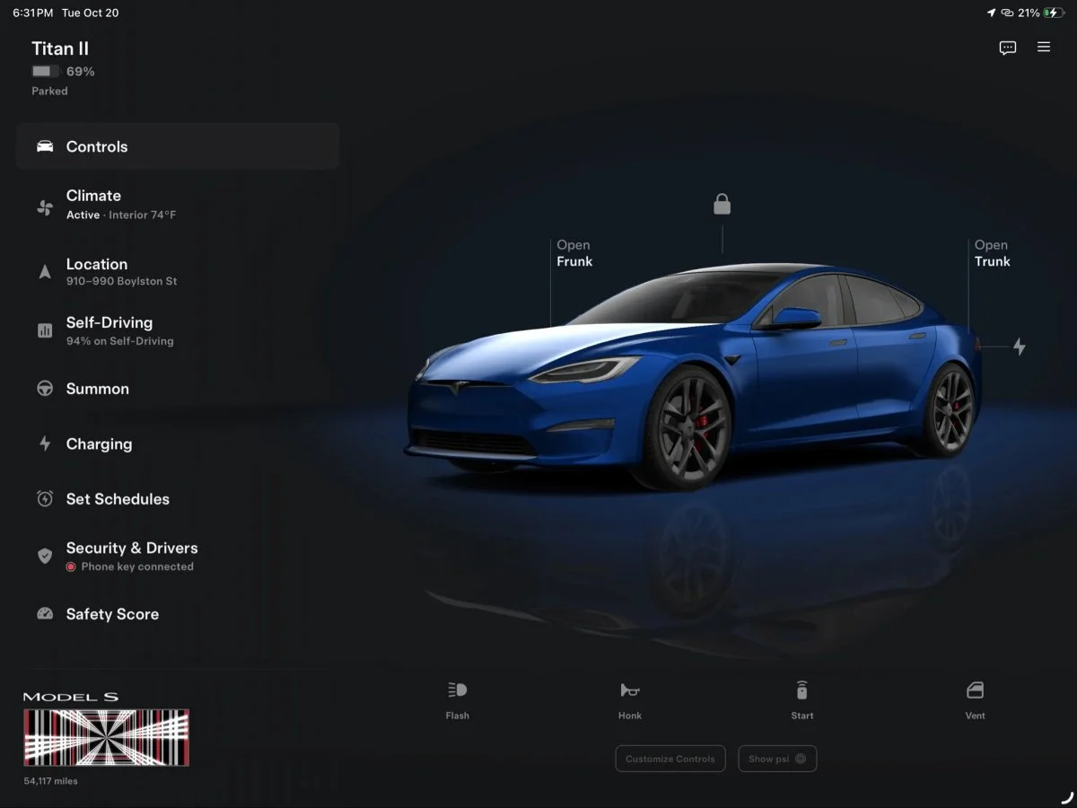
Tesla’s tablet and foldable app has a practical usability gap on some Android phones: unfolding the device doesn’t always bring up the larger screen layout. Tesla UI engineer Alex Guichet says the company will keep testing and refining the screen size breakpoints in a future update. For owners affected, rotating an unfolded phone to landscape currently brings up the expanded view.

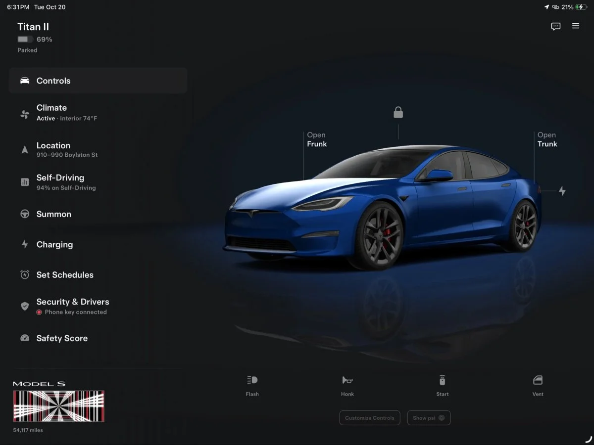
The dedicated app experience was recently introduced for iPad, iPhone Duo, Android tablets and foldables. Previously, those larger screens showed an enlarged phone interface, which made limited use of the available space. The new layout can put controls on the left and a larger vehicle display on the right, but the transition depends on how the app reads a device’s screen dimensions and orientation.
Why unfolding doesn’t always change the layout
A video shared by Pixel 10 Pro Fold owner @FCastrillo86 illustrates the issue. With the phone closed, Tesla’s app displays its normal phone layout. After unfolding, that same interface expands across the inner screen rather than switching to the tablet style. Rotating the phone to landscape finally triggers the larger layout.
That behavior can make the app feel inconsistent during a simple change in how the phone is held. In the user’s words, the interface “doesn’t feel cohesive when the layout split runs perpendicular to the screen crease.” He asked Tesla to make the expanded layout available in both orientations. Other users described a similar experience, including on screens close to a square aspect ratio.
For a foldable, screen size alone doesn’t describe the whole display experience. The app has to respond to the device’s current configuration as it opens, closes or rotates. A layout that works well on the outer screen may not automatically be the right fit for the larger inner panel. Tesla’s breakpoints, which determine when the app moves between layouts, are the part the company says it plans to refine.
The video’s author praised the new interface while pointing out this awkward transition. His post shows why the distinction matters: owners can get the intended large screen view, but have to rotate the device to reach it, even when the unfolded screen already offers substantially more room.
Android’s range of screens complicates the job
Apple offers Tesla a smaller set of screen sizes and aspect ratios to account for, according to the source report. Android spans a wider range of foldable phones and tablets, including devices with different inner and outer displays. Guichet acknowledged that variety in a reply on X: “Android is quite varied!” He added, “There are so many devices that it’s impossible to test them all,” and said Tesla would “continue to test and refine screen size breakpoints in a future release.”
That means the fix is likely to depend on how Tesla categorizes screen sizes and orientations across devices. A breakpoint set for one foldable’s proportions may not prompt the same layout change on another. The company hasn’t provided a date for the update or said which models will see a change first. Its stated plan is to keep testing and adjusting those thresholds.
Tesla has already updated the large screen app since its launch, with version 4.62.3 among the updates cited in the report. That history shows the interface is still being adjusted, though it doesn’t establish when the foldable behavior will be corrected. For users who see the stretched phone layout after unfolding, landscape rotation remains the available workaround.
What foldable owners should expect
The core feature is in place: Tesla has built an interface intended to use the extra room on tablets and foldable phones. The issue is when that interface appears. A foldable owner shouldn’t have to guess whether opening the phone will trigger the wider view, and Tesla’s planned breakpoint work is aimed at making that transition more predictable.
For now, the most useful distinction is device posture. The Pixel 10 Pro Fold example switches to the expanded layout after unfolding and rotating to landscape; the standard phone view remains on the outer display. Other Android devices may behave differently, given the range of screen sizes described by Guichet. Tesla hasn’t confirmed that every model will follow the same pattern or supplied a timetable.
The next app update will show whether Tesla can make the expanded layout respond more naturally across those screen shapes. Until then, owners can use landscape orientation to access the larger interface, while the company continues to tune the screen size breakpoints.