Tesla’s Redesigned App Brings a Dedicated Big-Screen Layout to iPad and Foldables
Tesla’s new tablet layout keeps vehicle controls, charging data and energy screens visible at once, with a gradual rollout underway.
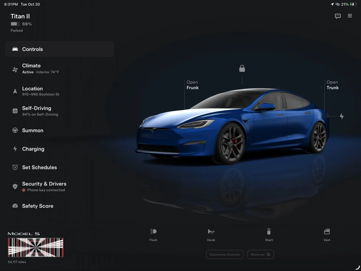
Tesla’s redesigned app makes larger screens more useful for managing a car and home energy system. The dedicated layout for iPad, Android tablets and foldables places navigation beside a detailed vehicle view, keeping key information and controls in sight instead of enlarging the phone interface.

The update is also built for Apple’s iPhone Duo. Its inner display can show the tablet-style layout, while the outer display returns to the familiar phone design when the device is folded. For owners who use a tablet to check charging, climate or vehicle status, the change is a more substantial upgrade than a simple increase in screen size.
Controls stay alongside the vehicle view
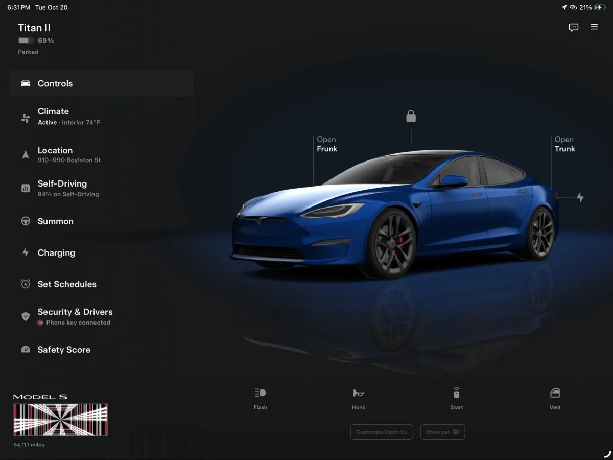
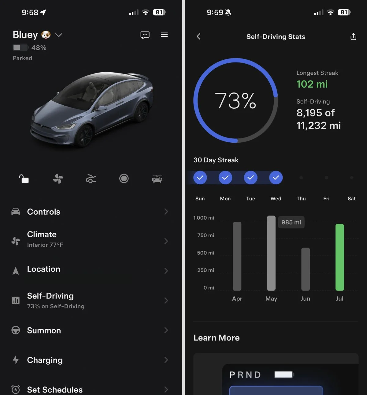
Previously, an iPad could run Tesla’s iPhone app, but the phone interface simply occupied more space. The new design uses a persistent menu on the left and a large vehicle visualization on the right. The menu includes Controls, Climate, Location, Self-Driving, Summon, Charging, Set Schedules, Security & Drivers, and Safety Score.
That two-panel arrangement changes how the app behaves when owners move between tasks. Open Charging, for example, and its submenu remains in the left-hand navigation while the relevant details appear across the rest of the display. Owners can move through settings without losing the overall vehicle view or repeatedly returning to a main screen.

The menu also surfaces cabin temperature and the share of driving completed on FSD. Those details give the home screen more immediate context, while the larger view leaves room for task-specific information. Tesla UI engineer Alex Guichet said the design team had reworked multiple screens for larger displays and was still considering further changes for later updates.
A more detailed rendering of the car
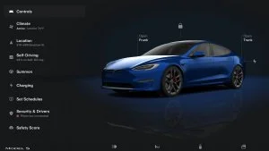
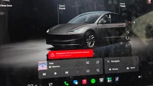
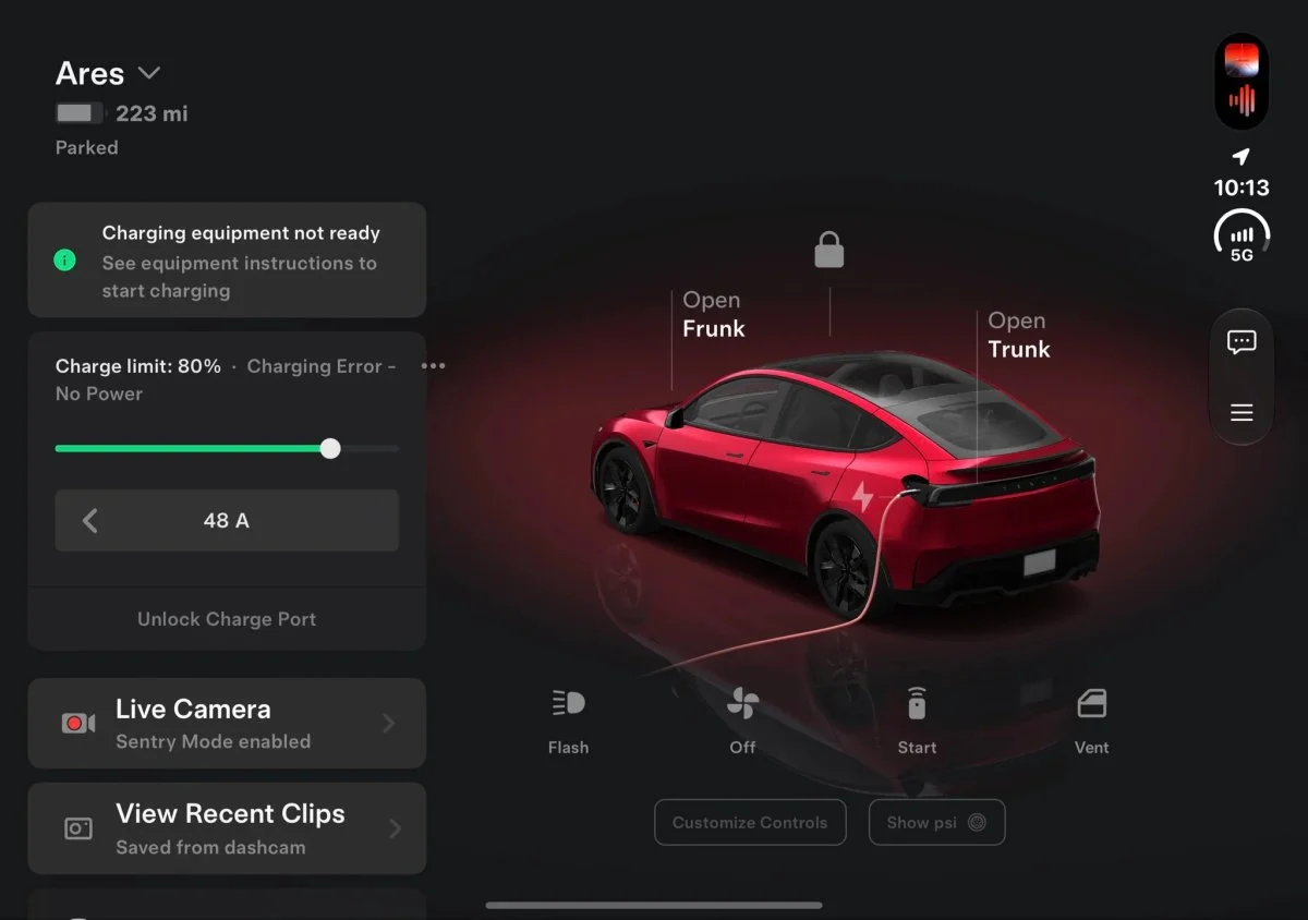
The vehicle model is more than an enlarged copy of the 3D image in the phone app. It resembles the parked vehicle view shown inside the car, with a background tint matched to the vehicle’s paint and reflections beneath it. The screen still supports direct actions: owners can open the frunk or trunk, lock or unlock the car, and check charging status from the visualization.
Quick actions sit below the vehicle view, including Flash, Honk, Start and Vent. A new Customize Controls button makes it easier to choose which actions appear in that row. There’s also a Show psi button, which puts tire pressures directly on the visualization rather than requiring a trip into the Controls menu.
That small change may matter most during routine checks. The large-screen format gives tire readings a natural place alongside the car, while customizable shortcuts let owners prioritize the actions they use. The source doesn’t specify whether every control appears for every vehicle or configuration.
Energy data gets more room
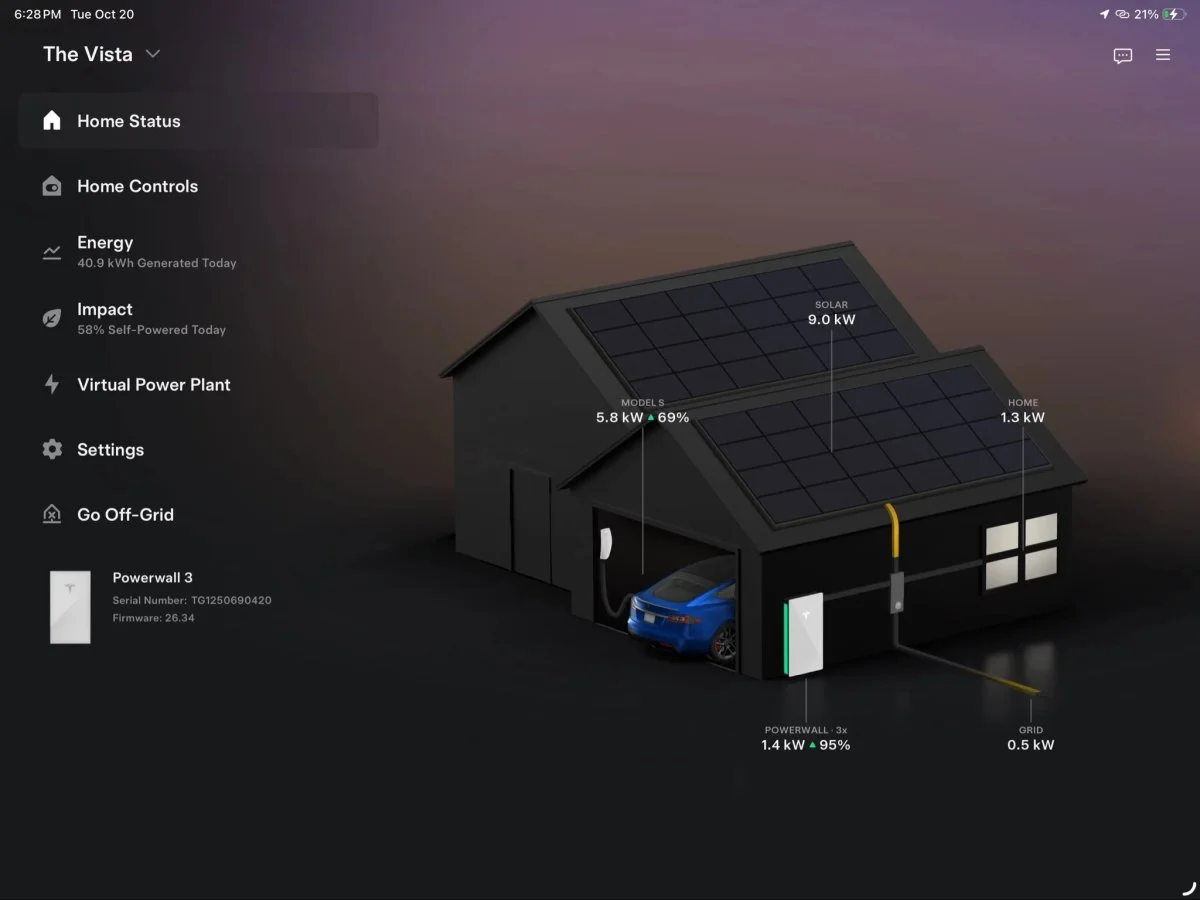
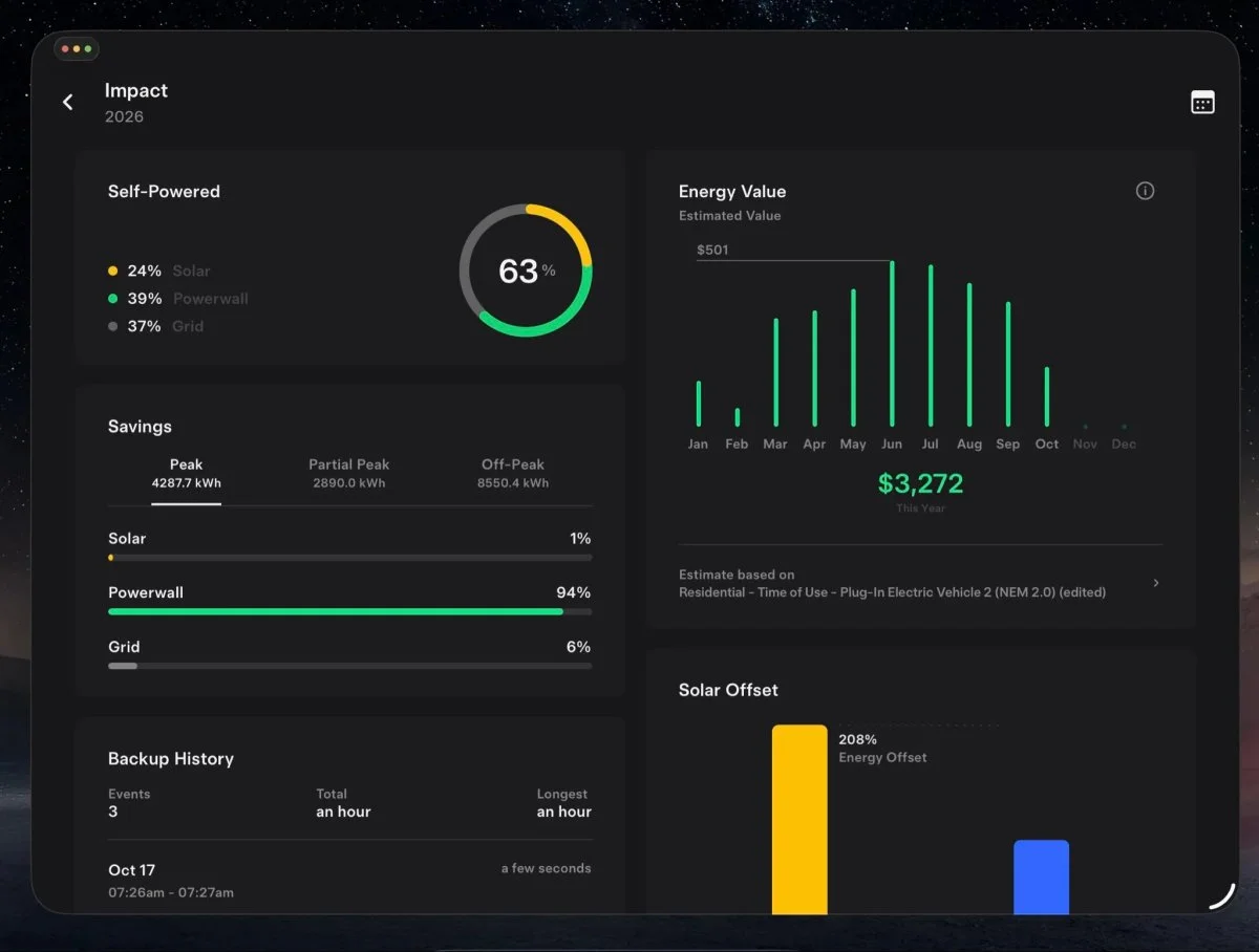
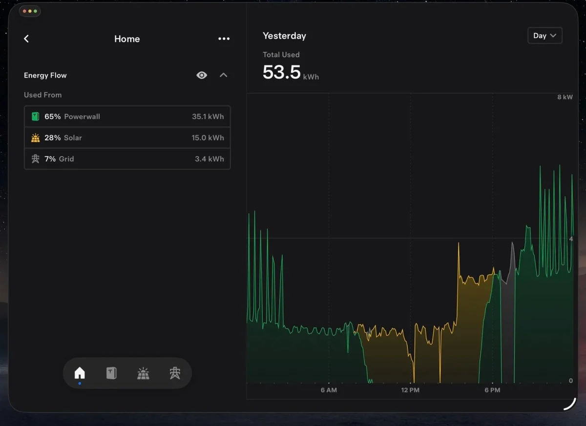
The redesigned interface also covers Tesla Energy customers. Home Status presents a 3D house with live readings for solar generation, Powerwall, household use, grid activity and a car charging in the garage. Energy, Impact, Virtual Power Plant and Go Off-Grid appear alongside the house view.
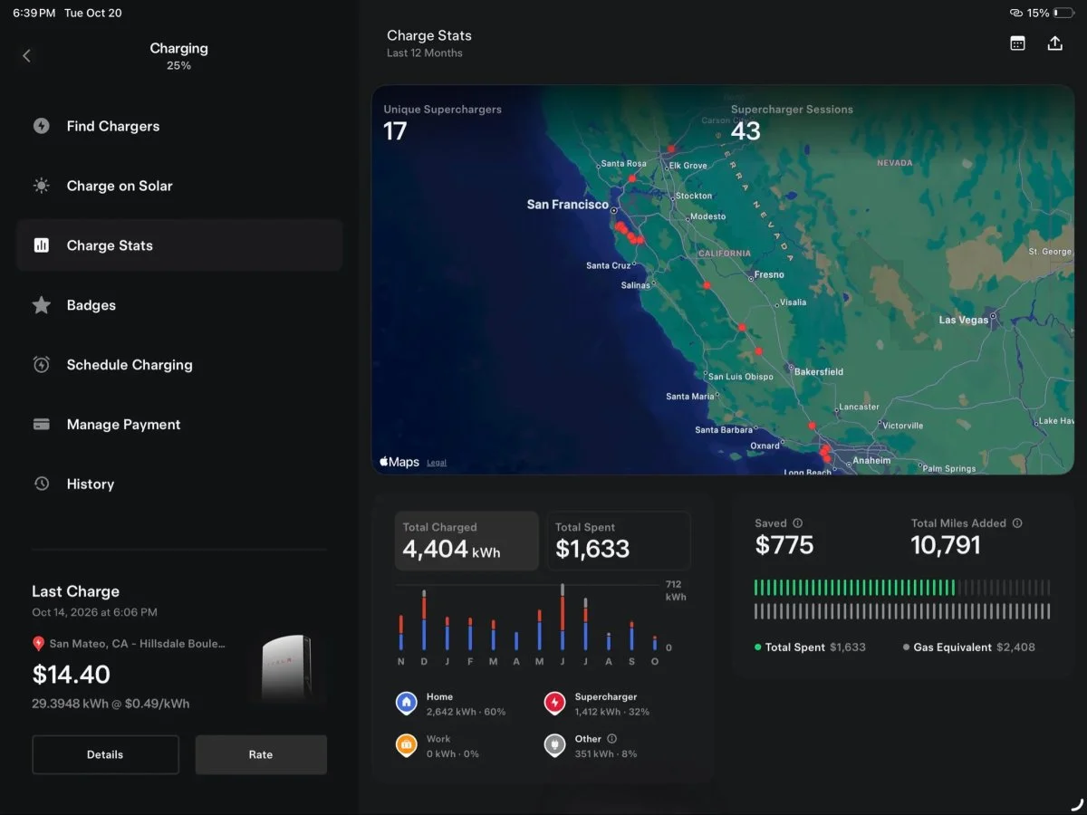
Charge Stats uses the wider display for a map of Supercharger locations visited, total energy charged, total spending, savings compared with gas and a monthly breakdown of charging locations. Charts and graphs have more room to breathe, which should make trends easier to scan than on a phone-sized screen. The supplied details don’t specify the period used for the totals or how the gas comparison is calculated.
Foldable support and rollout timing
On the iPhone Duo’s inner display, screenshots shared by Max Weinbach show charging details, Live Camera and recent dashcam clips on the left, with the vehicle view on the right. Close the device and the app switches back to the standard phone layout. The design therefore adapts to the foldable’s two screen sizes rather than keeping one layout in both states.
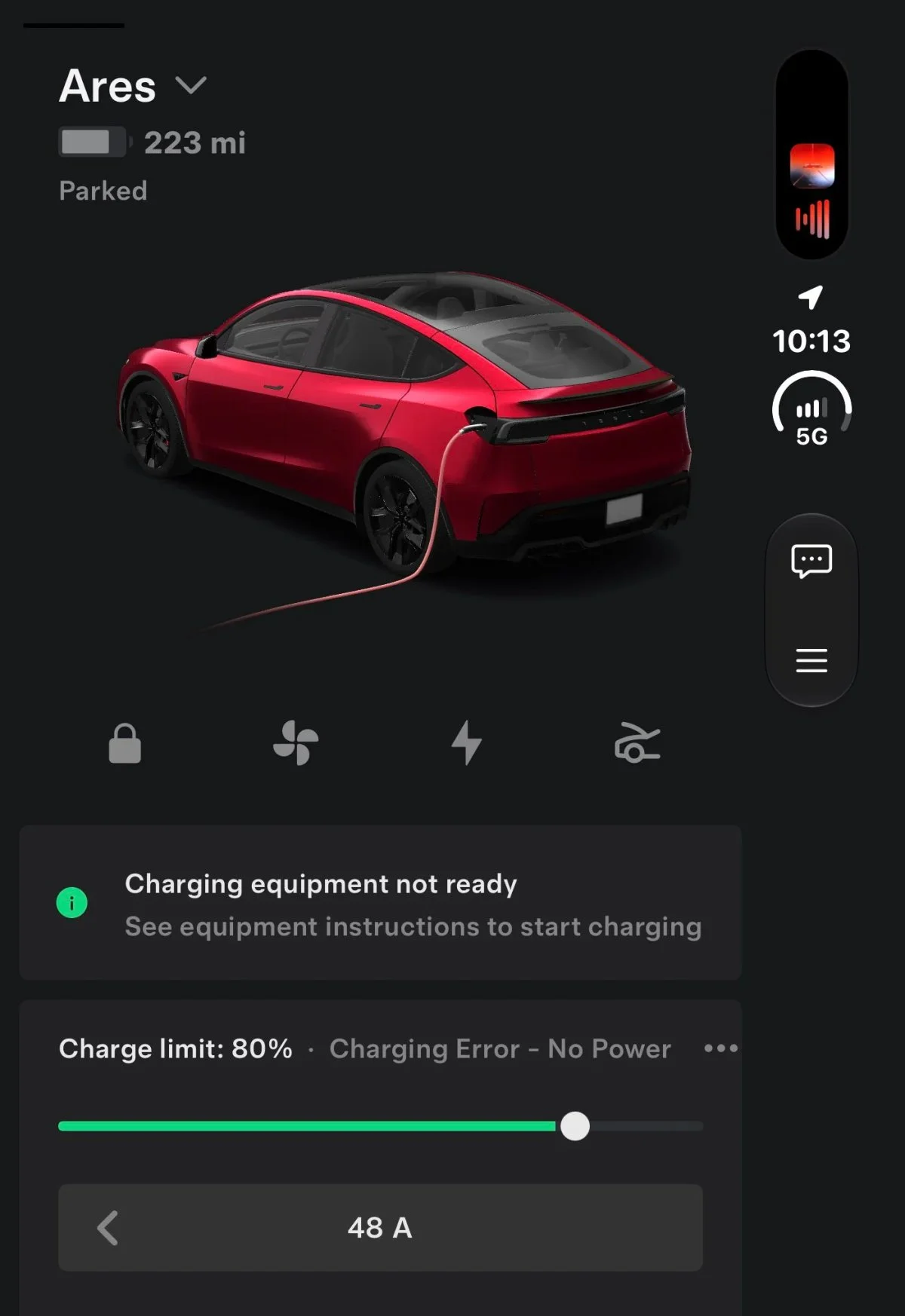
Tesla is distributing the update gradually. Guichet said it could take an extra week or two to reach everyone as the company checks how the interface appears across different screens. The update is expected to reach the App Store and Google Play, though no specific availability date is given.
The practical test will be whether the wider layout remains consistent across the many vehicle, charging and home-energy screens that owners use. Tesla says further refinements are being considered for future updates. For now, the clearest gain is straightforward: more information stays visible at once, with tablet and foldable owners no longer relying on an expanded phone interface.