Tesla Roadster UI Puts Adjustable Aero and Track Data at the Center
Tesla’s red and black Roadster interface visualizes active hardware and adds detailed Track Mode readouts. The design could change before production.
Tesla’s new Roadster interface has a job beyond displaying speed and charge: it makes the car’s adjustable hardware visible and gives drivers a dedicated view of track data. The red and black graphics are a sharp break from the familiar Tesla screen layout, though the Roadster’s production is not slated to begin until 2028. That leaves plenty of time for the software and its presentation to change.

The company showed the interface in a walkthrough shared on X, describing its design as inspired by fighter jet cockpits and centered on the driver. The strongest idea in the preview is functional: open a control, and the car’s visualization helps show which part or setting is involved. For a vehicle with several active aerodynamic features, that may make the controls easier to understand than a list of labels alone.
A cockpit built around vehicle controls
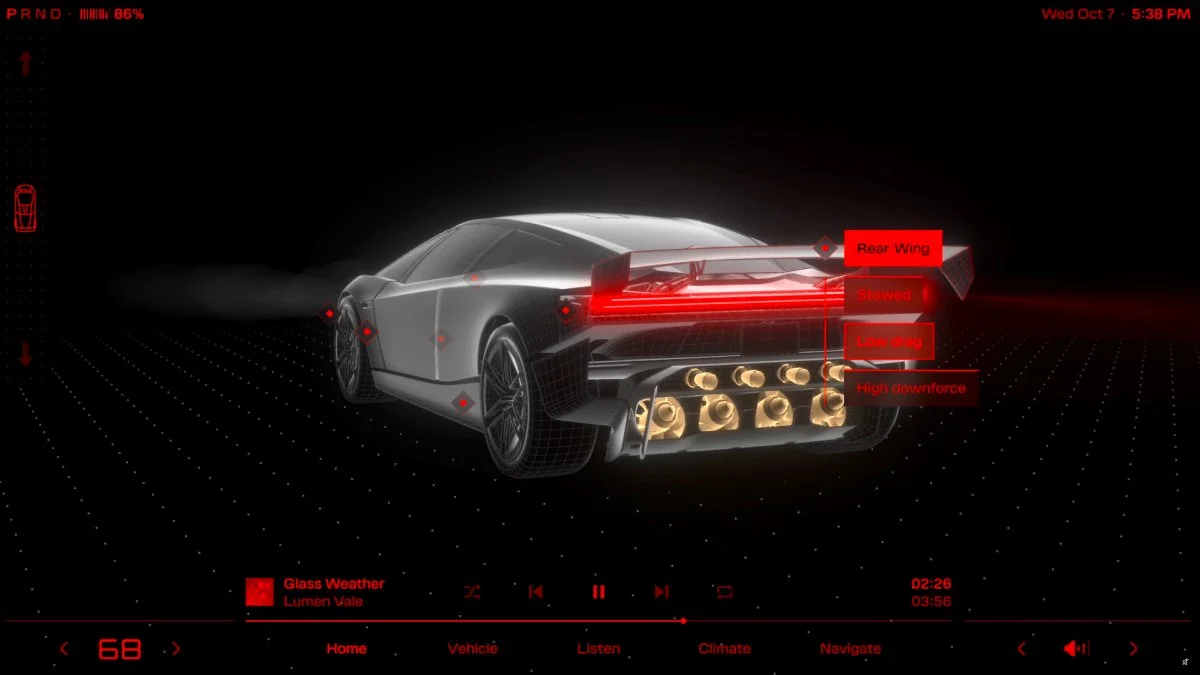
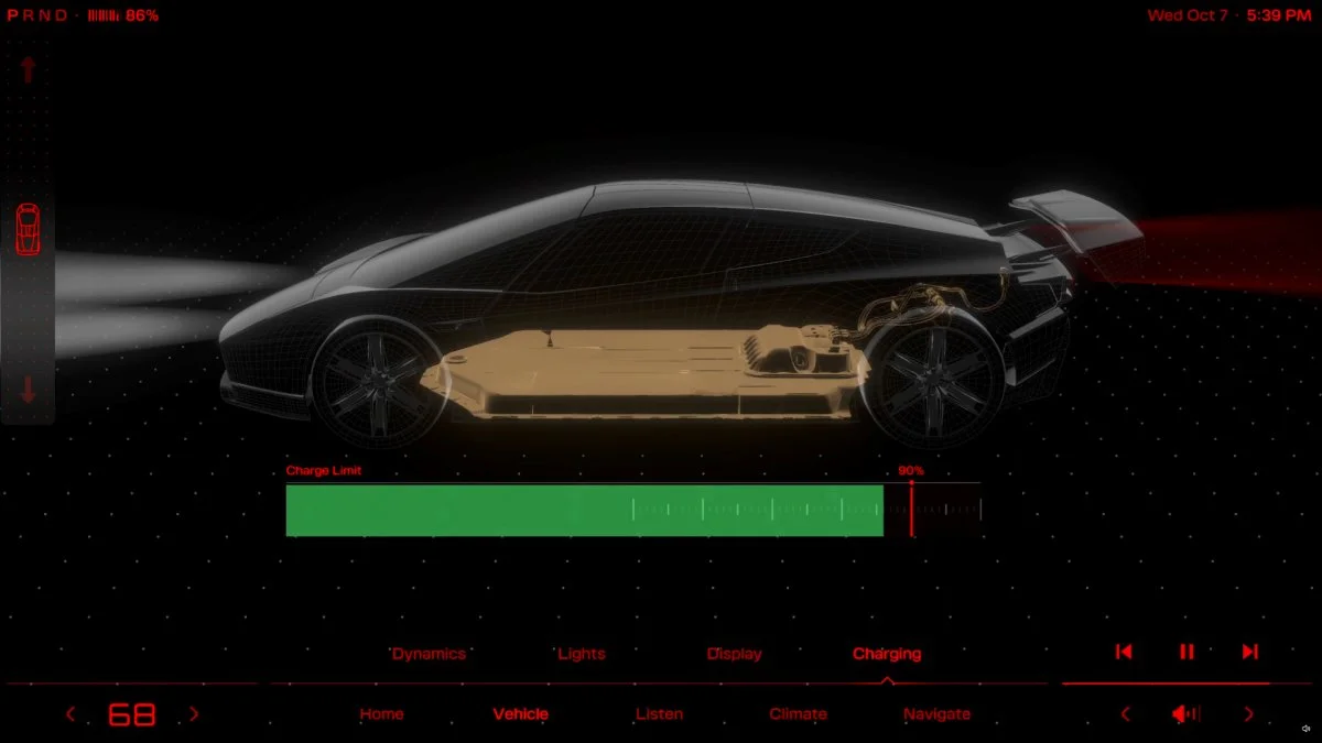
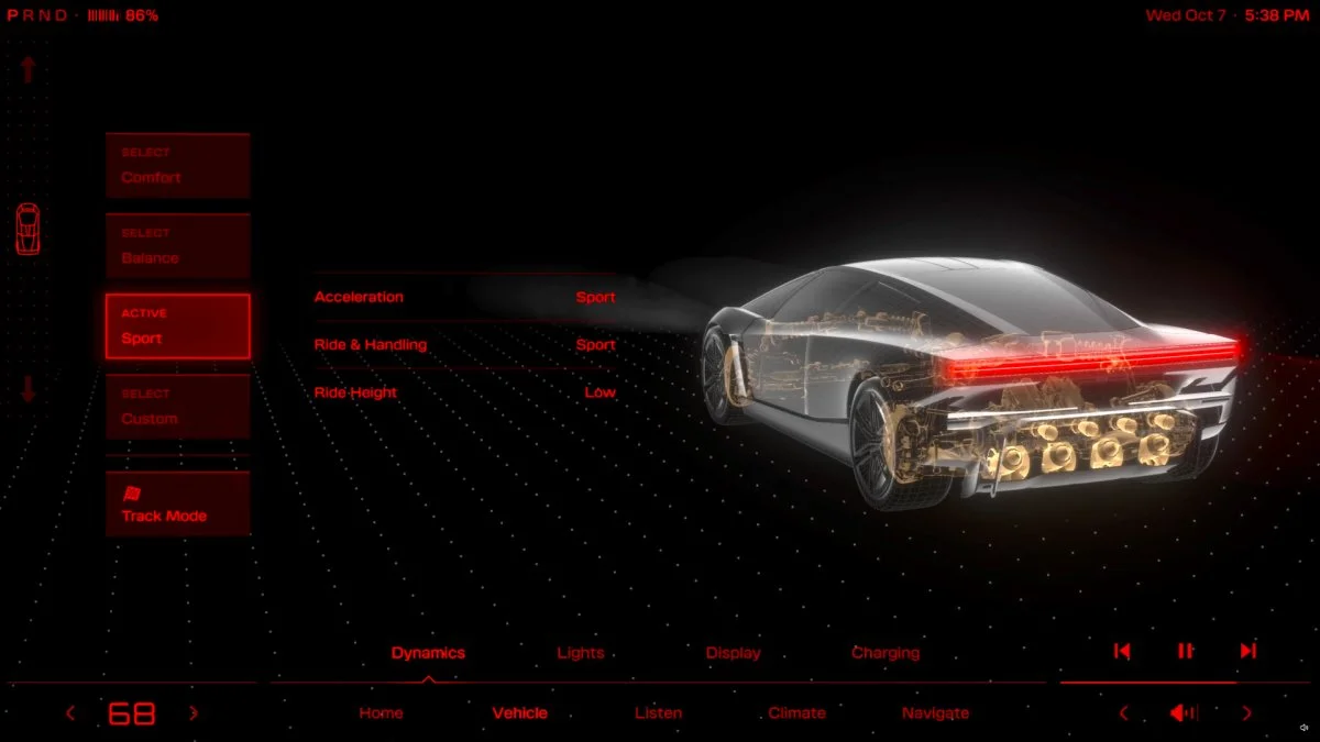
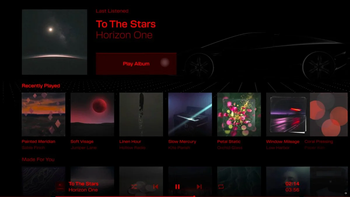
The main screen uses bright red graphics against black. A PRND gear indicator and battery percentage sit along the top, while the central vehicle display places a wireframe Roadster over a dotted grid. The look leans toward science fiction, including the visual style of Cyberpunk 2077, rather than the restrained interface found in Tesla’s current models.
Its top level is divided into Home, Vehicle, Listen, Climate, and Navigate. Vehicle opens a set of controls for Dynamics, Lights, Display, and Charging. Drivers can choose Comfort, Balance, Sport, or Custom modes, with each mode affecting acceleration, ride and handling, and ride height. Track Mode is available as a separate option for circuit use.
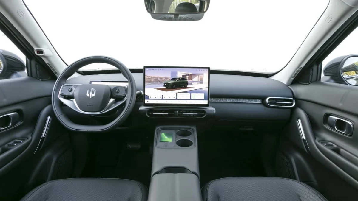
The center display is only part of the proposed cockpit. As described in an earlier look at the Roadster’s specifications and interior, the car is also expected to have a small red display near the windshield for speed and lap times. Together, the two screens would split general vehicle controls and driving information across different positions in the cabin.
Settings connect to visible hardware
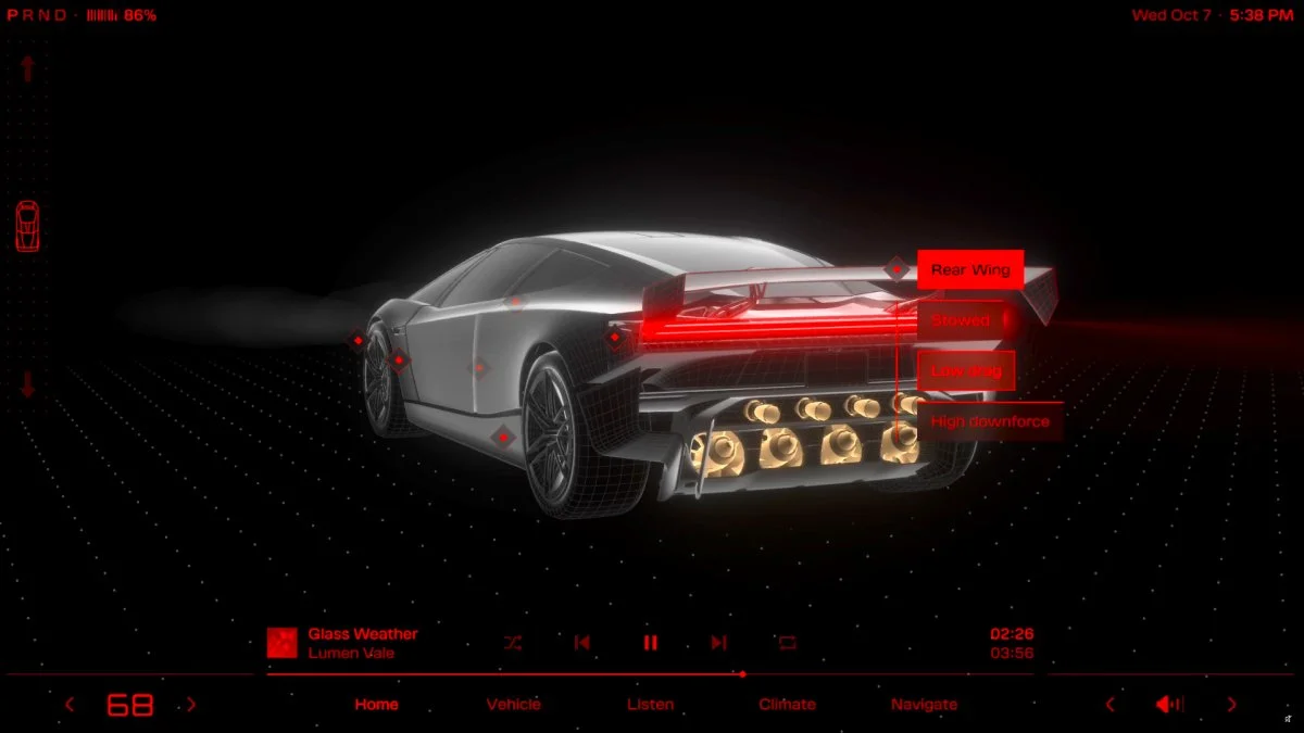
The interface’s most distinctive feature is the way the vehicle graphic responds to controls. In Dynamics, the suspension is highlighted in gold. Charging brings up a view of the battery pack and a slider for the charge limit. Selecting the rear wing offers Stowed, Low Drag, and High Downforce choices, while the barge boards and thrusters receive their own callouts.
That approach could help drivers understand what a setting changes before they select it. The Roadster is presented with active elements ranging from its wing to pop-down headlights, so a visual map of the car has a practical role as well as a stylistic one. The preview shows how Tesla plans to connect those components to the touchscreen, but it doesn’t establish how the controls will work in the finished car or how much of the displayed hardware will reach production.
Track Mode trades the car graphic for data
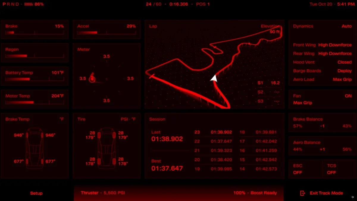
Track Mode replaces the main vehicle illustration with a denser instrument panel. The preview includes brake and throttle inputs, battery and motor temperatures, brake temperatures, and tire pressures for each corner. It also shows a G-meter, a live track map with sector times, and a lap log.
Drivers can adjust aero balance and brake balance, control the suction fan, and toggle ESC and traction control. The Thrust and Rocket trims are shown with additional cold-gas pressure information and an indicator for whether the thruster system is ready to boost. Those details make the display more specific than a general performance screen, although the walkthrough doesn’t provide measurements, timing results, or an account of how the information behaves on track.
Prototype styling leaves room for change
Some familiar Tesla conventions remain underneath the new graphics. Climate controls sit at the bottom left, volume at the bottom right, and media controls run along the bottom edge. That arrangement suggests the Roadster could retain the basic structure of Tesla’s standard software under a custom visual layer, similar to the approach used in the Cybertruck.
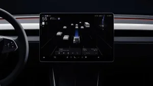
There’s precedent for a prototype interface changing substantially. An early Cybertruck interface combined the map and vehicle visualization in one view, while the version that reached owners was much closer to the wider Tesla layout. The 2016 Model 3 prototype interface also used a map-heavy design with the speedometer overlaid, a layout that did not carry through to the production model.
Sawyer Merritt shared an earlier hands-on view after spending time with the Roadster at its October 2026 reveal event, praising its “retro-futuristic design aesthetic.” The car is on display at LA’s Petersen Automotive Museum through Tuesday, but it is roped off, so visitors cannot try the interface.
For now, the preview makes a clear case for how Tesla wants the Roadster’s software to feel: visually distinctive, centered on adjustable vehicle systems, and prepared to display detailed track information. With production scheduled for 2028, the useful question is how much of this control layout and screen design survives the move from display car to customer car.